Pantone’s Color of the Year: Very Peri
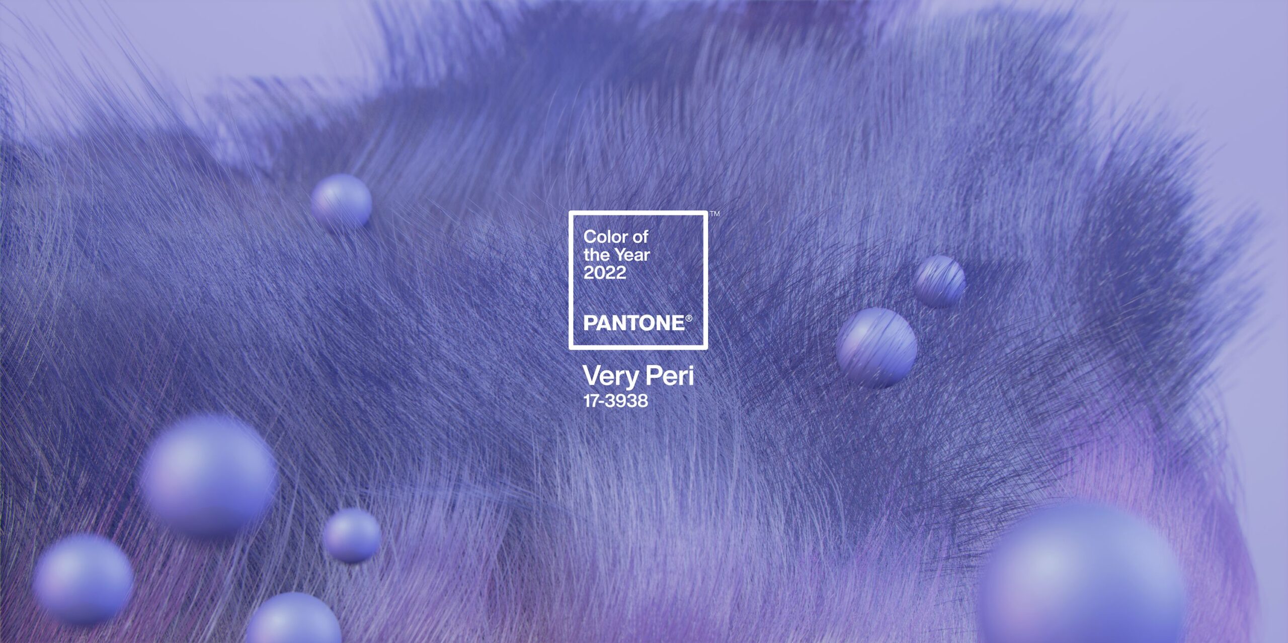
Each year, the Pantone Color Institute names the one color they feel most captures the mood of the times we’re living in. Remember the revolutionary Millennial Pink, which muddied the sweetness out of ordinary pinks and became the darling of every, you know, young millennial woman? Or last year’s duo of yellow and gray, a surprise pairing that spoke to both yellow’s sunny disposition and gray’s somber take on the times? This year’s choice is a lot more playful – and a tad more controversial.
Enter Very Peri. Described by the Pantone Color Institute as “displaying a carefree confidence and a daring curiosity that animates our creative spirit…Very Peri helps us to embrace this altered landscape of possibilities, opening us up to a new vision as we rewrite our lives.” In other words, like so many things, it’s a color influenced by pandemic living, and the impact COVID has had upon all of us. It’s relaxing, like all blues; yet tinged with a violet red undertone to indicate renewed energy – energy, we suspect, fueled by the hope offered by vaccines and their promise of an end to the pandemic.

(Wallcoverings by Gracie Studio & Osborne & Little)


While we’re all for a good blue, and a glass-half-full take on life, we can’t say we’re enthralled by Very Peri. It’s a bit bright for us. And so, in our estimation, it’s best reserved as a cheerful pop of color. “I could see incorporating it into a room through abundant armfuls of blue hydrangeas,” says Shea, “or a well-placed pillow.” A stack of Very Peri-spined books atop an antique console would do the trick for Martin. “I think you’d want to be pretty restrained with a color like this,” he says. “You could get tired of it pretty quickly, so a low-commitment way to incorporate it into a design scheme would be my choice.”


Look for Very Peri to begin showing up in housewares, apparel, furnishings and wallcoverings, possibly those offered by contemporary brands such as Brabbu and selections at Design Within Reach. We also discovered beautiful wallcovering designs by Gracie Studio and Osborne & Little. It’ll likely become a popular nail polish choice, make its way into product packaging, and even feature in graphic design. And we’re all for it. We just can’t quite see choosing Very Peri for our next dining room paint color!


