Different Styles, Common Goals
What happens when two interior designers with very different aesthetics – but perfectly synced opinions on the importance of creating uniquely personal spaces – design their own homes? Soucie Horner principals Shea Soucie and Martin Horner are about to show you. Because while they may be hugely successful business partners and lifelong friends, their approaches to achieving homes that reflect their (and their clients’) unique lifestyles are quite different. Read on for three examples of what we mean.
Shea’s Kitchen
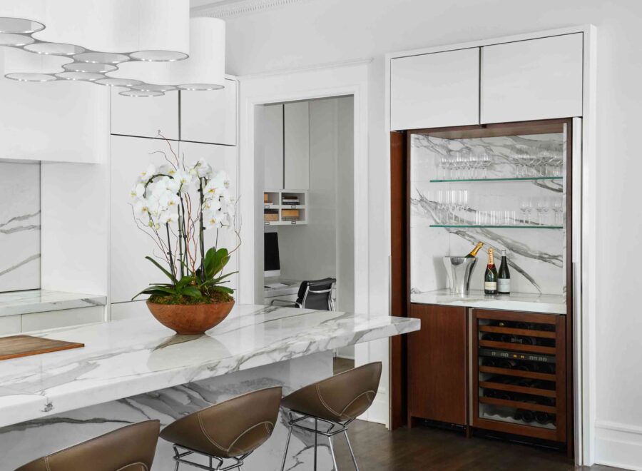
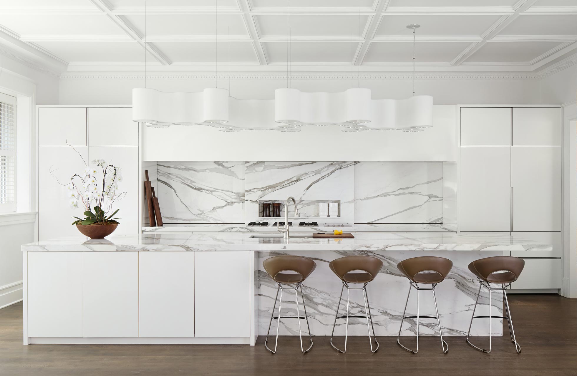
With four active kids and a big teddy bear of a dog, Shea’s happy household is lively in the best possible way. Add running a business, frequent travel, and the fact that she’s surrounded by color and pattern all day at the office, and you can understand her need for calm and respite at home. Hence Shea’s affinity for clean, uncluttered, white spaces, which is on spectacular display in the kitchen of her fully renovated historic home.
Unadorned cabinetry conceals dishes, glassware, and small appliances; countertops are clear save the occasional texture-rich accessory; and the only pattern in sight comes courtesy of beautifully veined marble. “My life is so busy,” Shea says, “that I really need my visual surroundings at home to be quiet and peaceful.”
Martin’s Kitchen
Martin, on the other hand, shares his architecturally classic home with another adult – his fiancé Ryan – and, no surprise to anyone who knows his love of dogs, their spaniel Oliver.
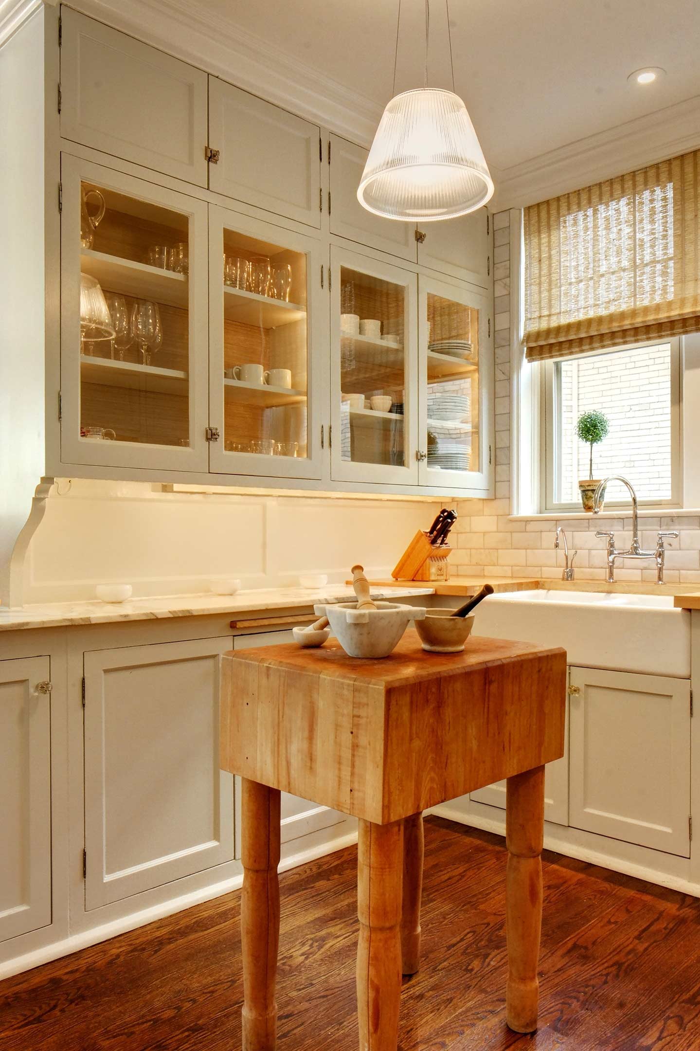
An avid collector, Martin enjoys showcasing the objects of his desire for all to see and enjoy, which is best accomplished via glass-front cabinetry in his kitchen and butler’s pantry. If it’s beautiful, it’s on display! Woven window shades, richly grained hardwood floors, and a butcher block add texture to this warm and cozy space.
Shea’s Family Library
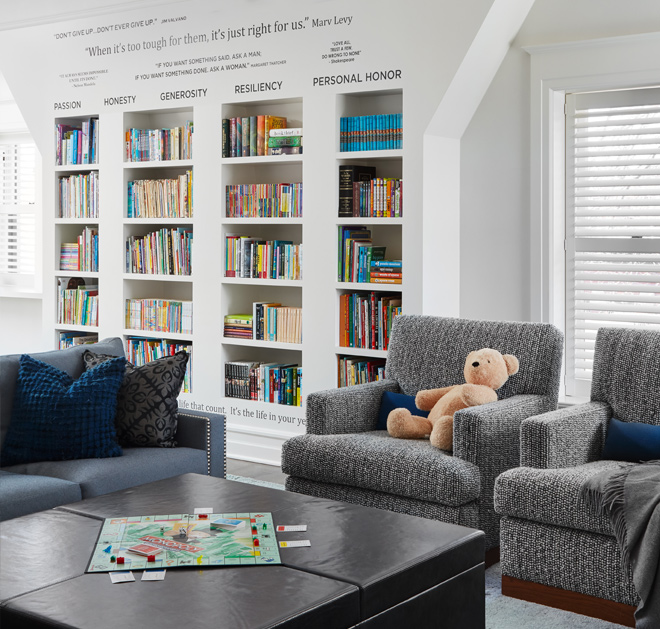
Designed to gather the family for movie night, encourage the kids to read, and offer a quiet study space away from the first floor action, Shea’s second floor “kids’ family room” is filled with comfortable, tailored furnishings in neutral hues and kid-friendly materials.
Books are organized into columns for each of her children; quotes with meaning to Shea and her family are stenciled on the walls above to motivate and inspire. Plenty of rough-and-tumble fun takes place in this room, yet by design it exudes the same, orderly calm as the rest of her home.
Martin’s Library
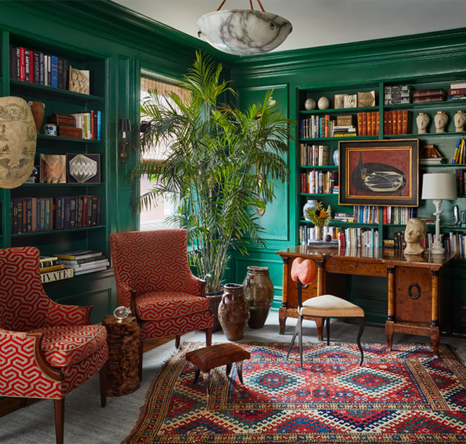
See what we mean about contrasting styles? Martin’s library overflows with verve courtesy of color, pattern, and fearlessly sentimental style. Shelves are artfully piled with literary works, themselves layered with meaningful mementos: here, a treasured collection of altered books; there, a strand of beads from a particularly memorable Mardi Gras weekend.
To admire Martin’s bookshelves is to join in remembrances of vacations past, parties hosted, and flea market treasures found. The pleasure Martin receives from displaying things that make him smile is rivaled only by the satisfaction he feels from playfully mixing and matching furniture styles, eras, and fabrics. “If I love it, I’ll find a way to make it work,” he says. “It’s all about feeling great in your surroundings.”
Shea’s Primary Bedroom
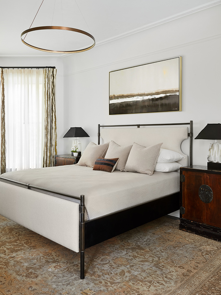
Shea’s primary bedroom, where each of her carefully curated furnishings communicates her appreciation for handcrafts, continues her home’s quiet color palette. There’s the custom iron bed with its pale leather headboard. The antique rug, coveted ever since Shea and her husband, Chris, first fell in love with the floorcoverings they discovered on their honeymoon in Turkey.
The antique side tables that blend patinaed wood with aged brass ornamentation, accessorized with a pair of matching bedside lamps whose classically shaped shades hover over sculptural bases. Though there is pattern, it is minimal. And muted.
Martin’s Primary Bedroom
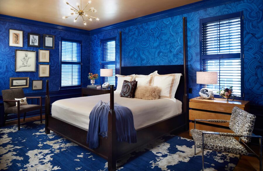
The same cannot be said of Martin’s primary bedroom! A riot of deep, rich, saturated color, its hand-painted cobalt blue walls are matched for drama only by the custom oxidized wool and silk SHIIR rug on the floor.
An exhilarating decorative envelope, the blue hue is an ideal backdrop to a gallery wall of nudes, mismatched bedside tables, and a cherished, inherited, leopard print chair. Shy, it is not –yet importantly, it still manages to lull easily courtesy of calming, creamy white bedding that provides a landing spot for the eye.


