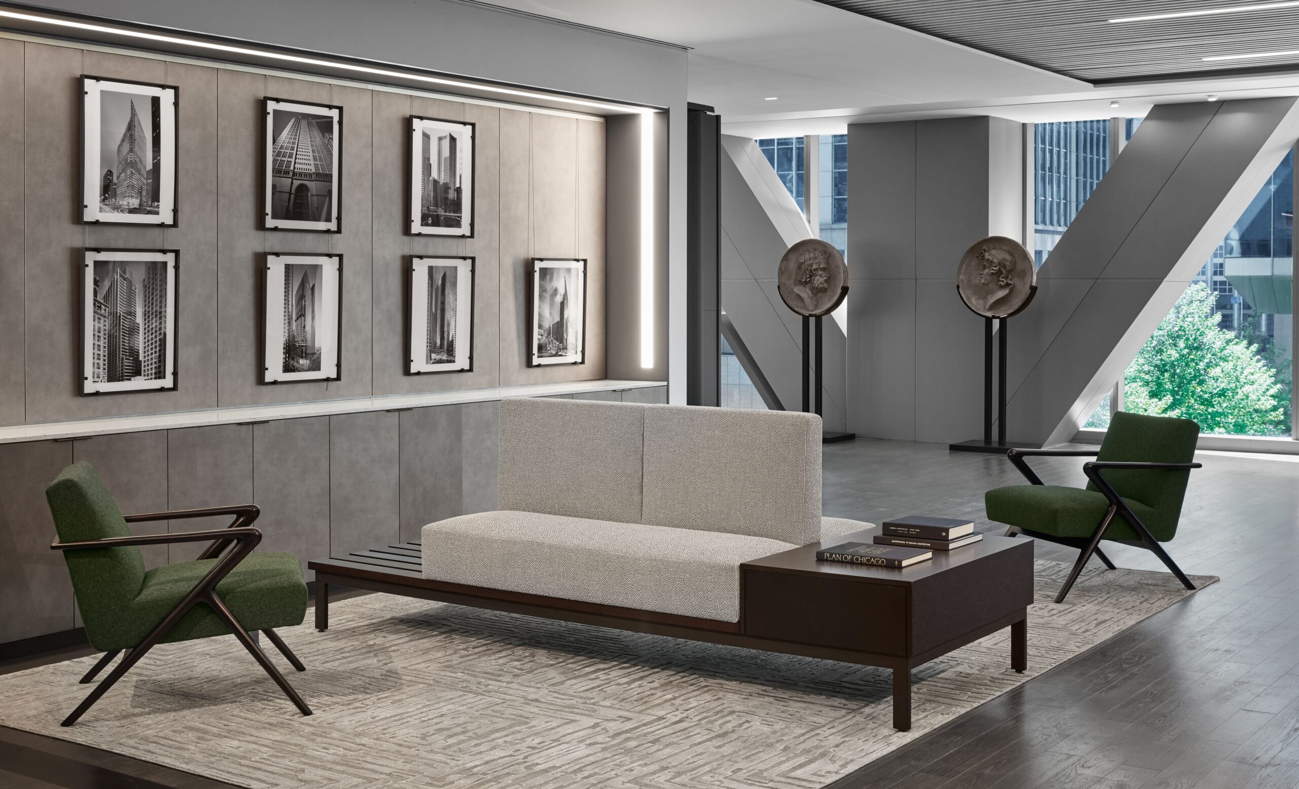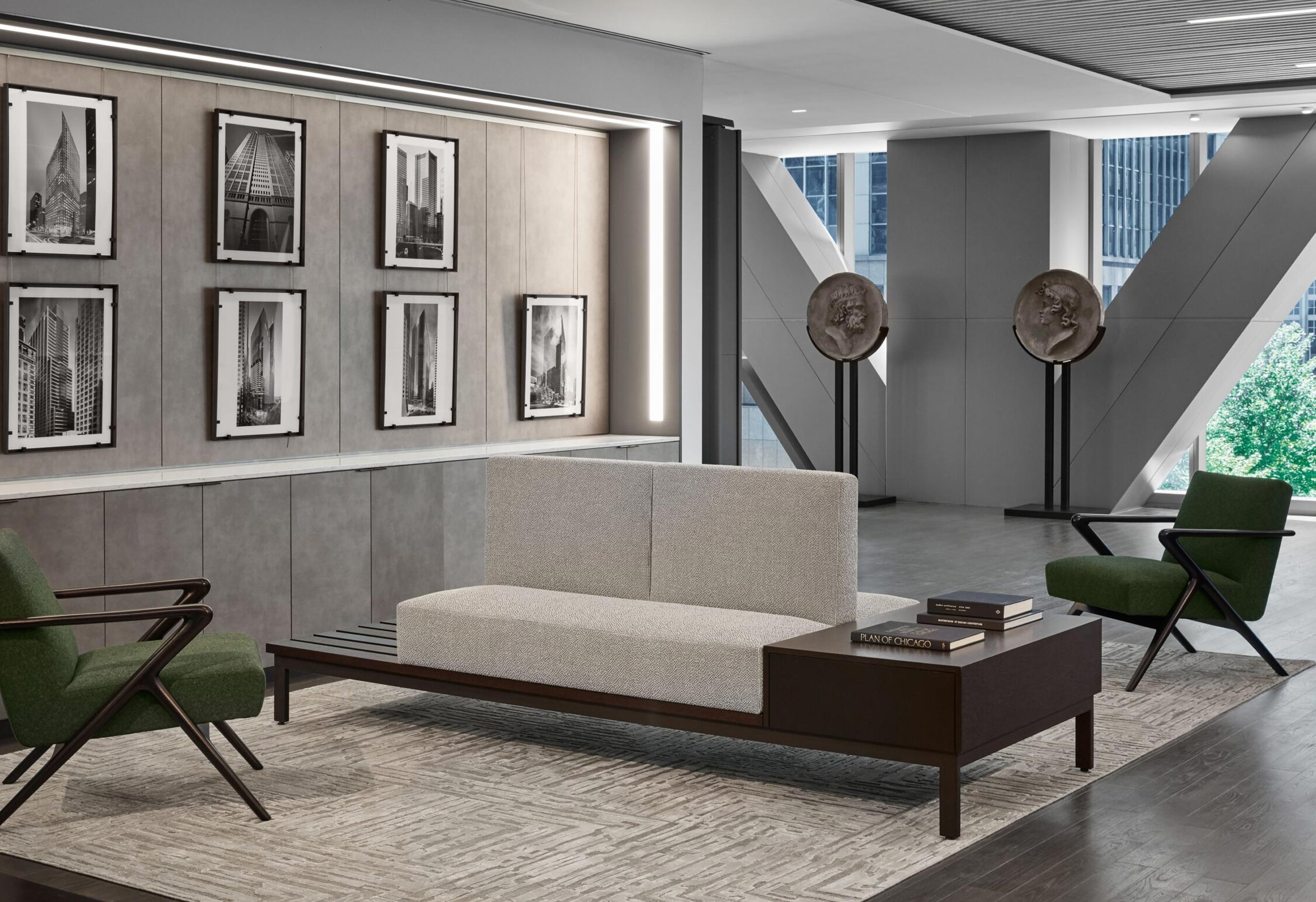
SH Studio: Commercial Design
Some designers believe residential and commercial projects are two completely different beasts. At Soucie Horner, we respectfully disagree. In fact, the design process – and the end result – is often more alike than you might think, whether we’re working on a single-family home on Chicago’s North Shore, or a rental apartment building such as Wolf Point East in the heart of the city.
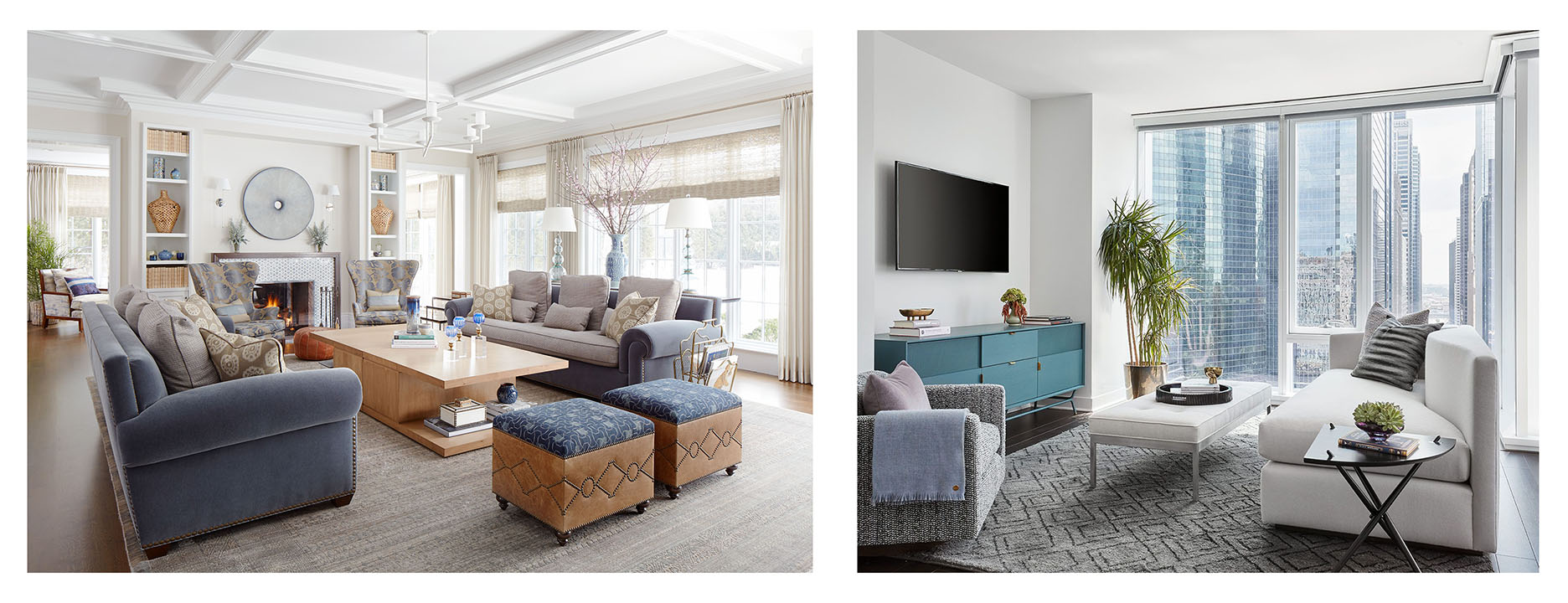
While this may come as a surprise, the reality is that all clients – whether residential or commercial – value the same three priorities: design, cost, and schedule. What differs is the order in which they rank those priorities. Between our Soucie Horner Interiors division and our commercially focused SH Studio division, we’re able to navigate the differences in those rankings with ease.
For instance, residential clients will typically place design at the top of their priority list. Commercial clients tend to be more concerned with cost and schedule. They assume design will have to take a back seat to meet those concerns – which is why they’re often delighted to learn that after twenty years in the luxury residential interior design business, we know exactly how to leverage our experience and translate it to the commercial world.
Regardless of which way a particular client leans—and whether we’re working on a luxury high rise, a retail site, or an office space—we create designs geared around the way spaces need to function to enhance their occupants’ lifestyles. So, while a shared amenity space in a condo tower, for instance, needs to enhance the marketing around the building’s brand identity, it also needs to make residents of the building feel the space is an extension of their own unit. It needs to make employees in an office kitchen feel as though they’re lunching in their own kitchen at home (though probably a better-designed one!). “SH Studio leverages everything we know about luxury residential and applies it to commercial design,” says Shea. “It’s not a great leap for us to understand how to translate those desires into commercial applications.”
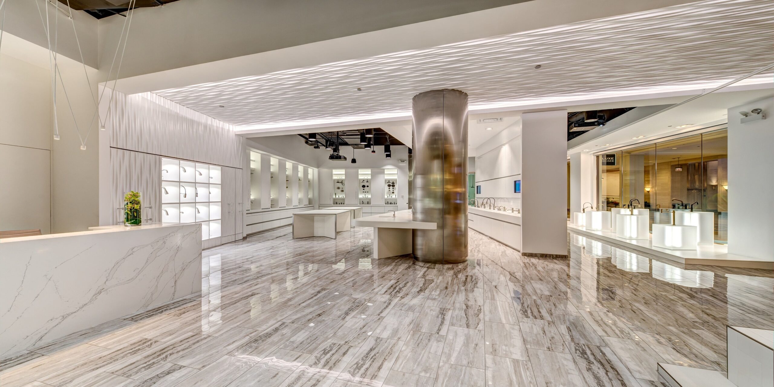
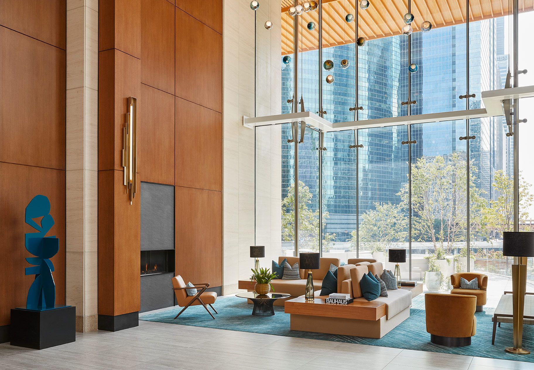
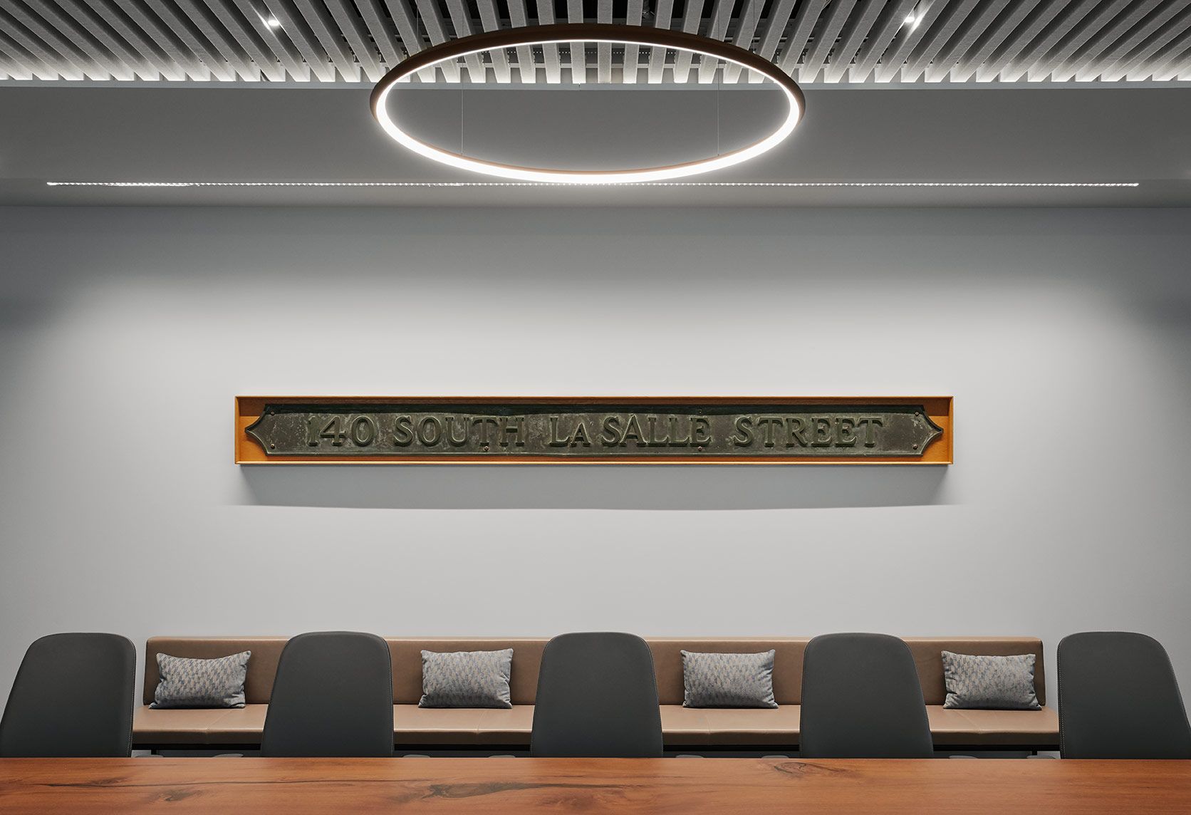
The best evidence of our ability to cross over between the two categories is our many commercial clients who started out as residential clients. They saw first-hand the ways good design can apply to space, environment, and even product – and that good design doesn’t have to come at the expense of meeting a number or achieving a deadline. In the right hands, good design can be considered just one component of a successful project.
This broadens our contribution far beyond the way a space looks and feels to include numbers-driven considerations such as visual marketing, brand identity, and targeted marketing. More than buzzwords, these are among the guidelines that enable us to create spaces that are equal parts gracious, dynamic, and functional, while simultaneously producing that all-important return on a client’s investment.
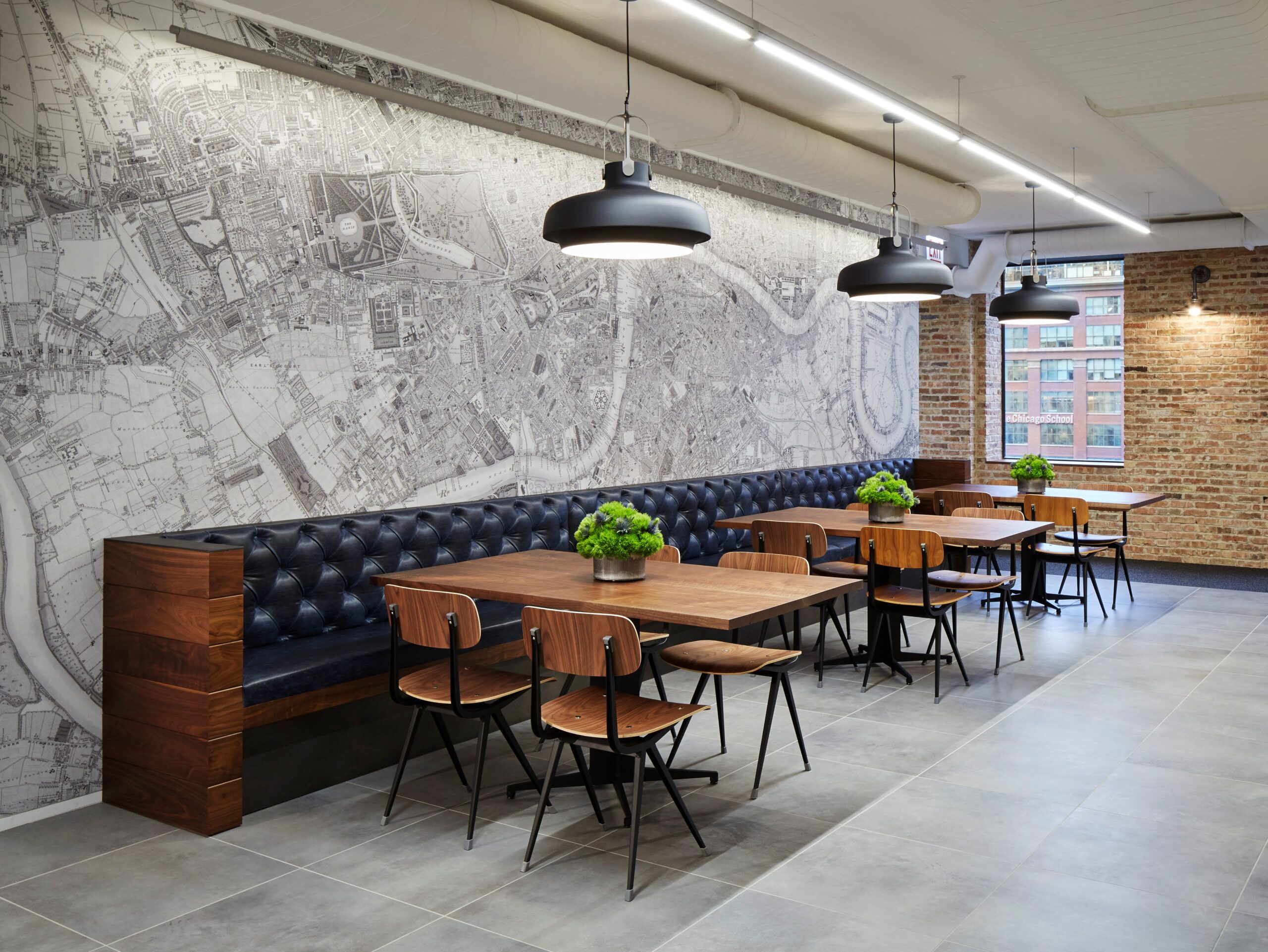
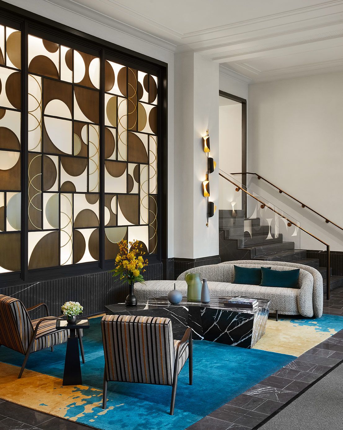
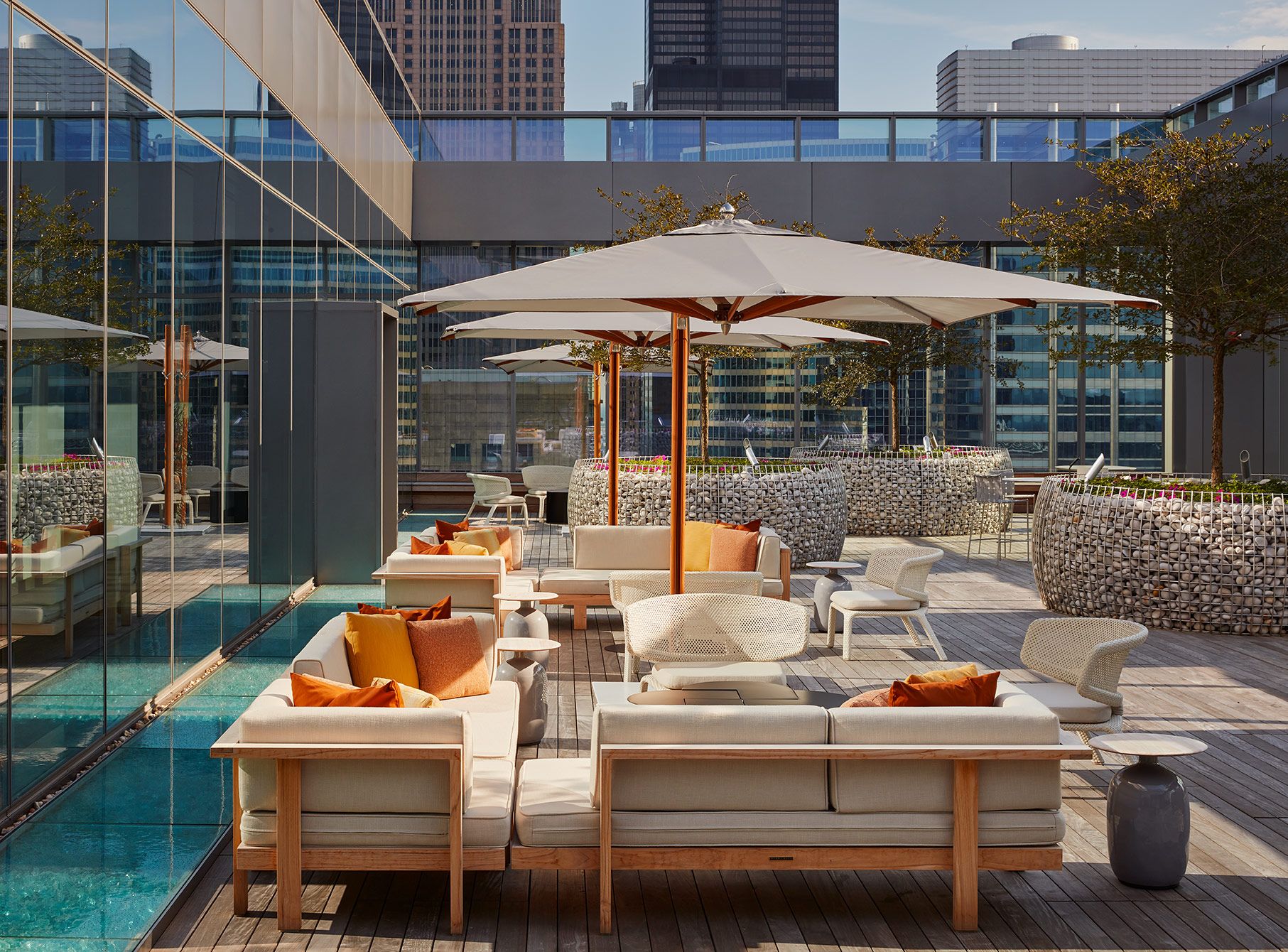
In other words, SH Studio does not simply design spaces where people live, work, and engage with their communities; we conceptualize environments where people feel comfortable and productive. “This knowledge allows our luxury division to transpose into the commercial world in a way that’s not just about square footage,” says Martin. “It allows us to incorporate beauty and creativity into projects in a way developers might not have thought was possible.”


