Leaders of Design Conference in Japan
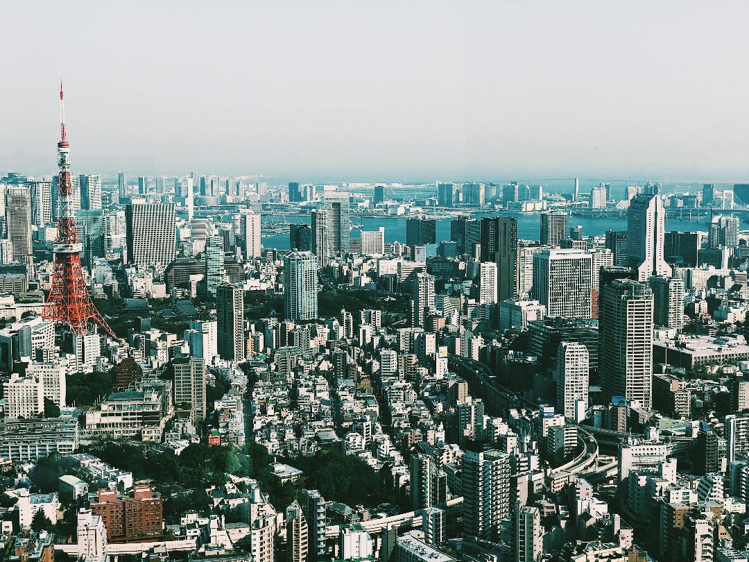
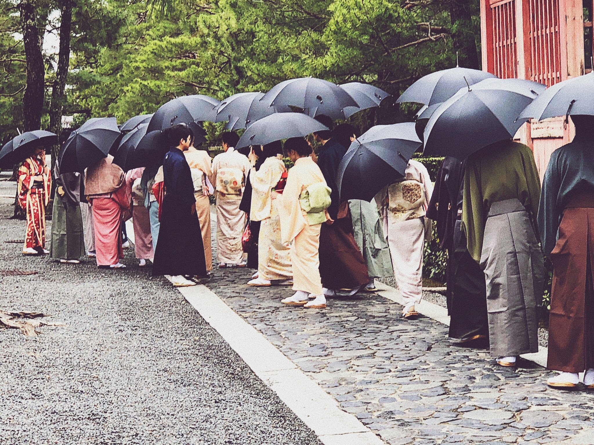
This past March, Shea and Martin attended the annual conference for the Leaders of Design Council. This year’s expedition took them to the Land of the Rising Sun. With futuristic skylines, gleaming skyscrapers, lush landscapes seemingly untouched by modern technology, ancient shrines, and cuisine that could easily be performance art as much as a culinary experience, Japan is a country that demonstrates the dichotomy and merger of the ultra-modern with the traditional. It was a week of sensory exploration, professional education and cultural appreciation in a refined country that understands its minimalistic roots and incorporates this ideology in every aspect of its culture. Traveling through Tokyo, Kyoto, Naoshima Island and Hokkaido, Shea and Martin took us through a narrative journey of their extraordinary trip.
LET’S START WITH A GENERAL QUESTION. WHAT WERE THE HIGHLIGHTS OF YOUR TRIP?
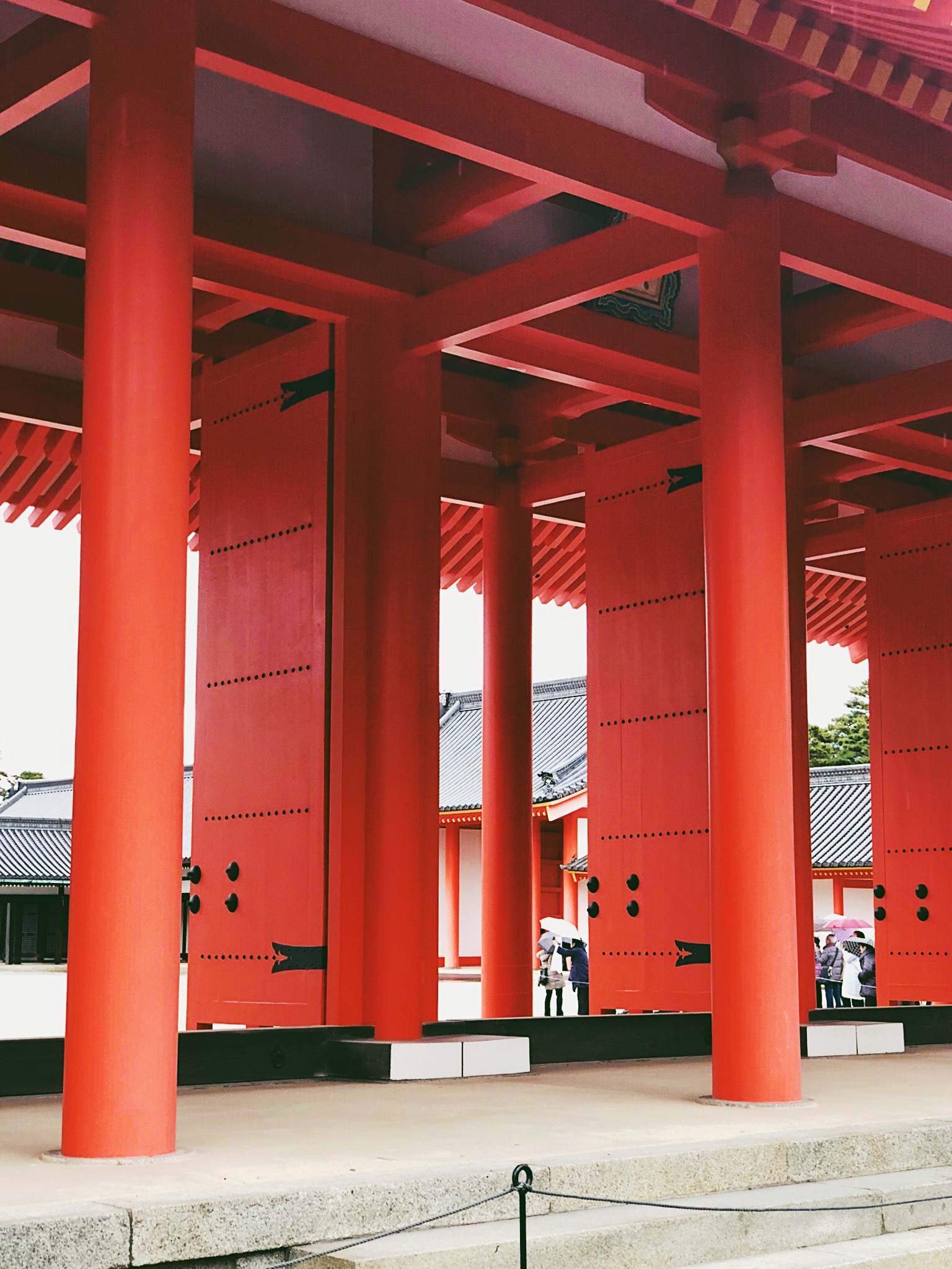
Traveling with our colleagues with the Leaders of Design Council was valuable. It allowed us the time to look at the country through a design lens. We were able to touch and feel design in a different culture. Exposing ourselves to other cultures gives us direct experience, and that type of exposure is invaluable in relating and connecting to our clients.
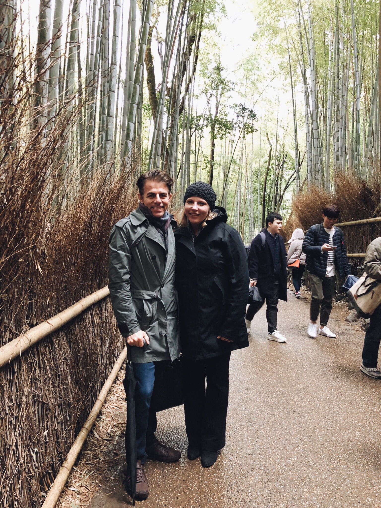
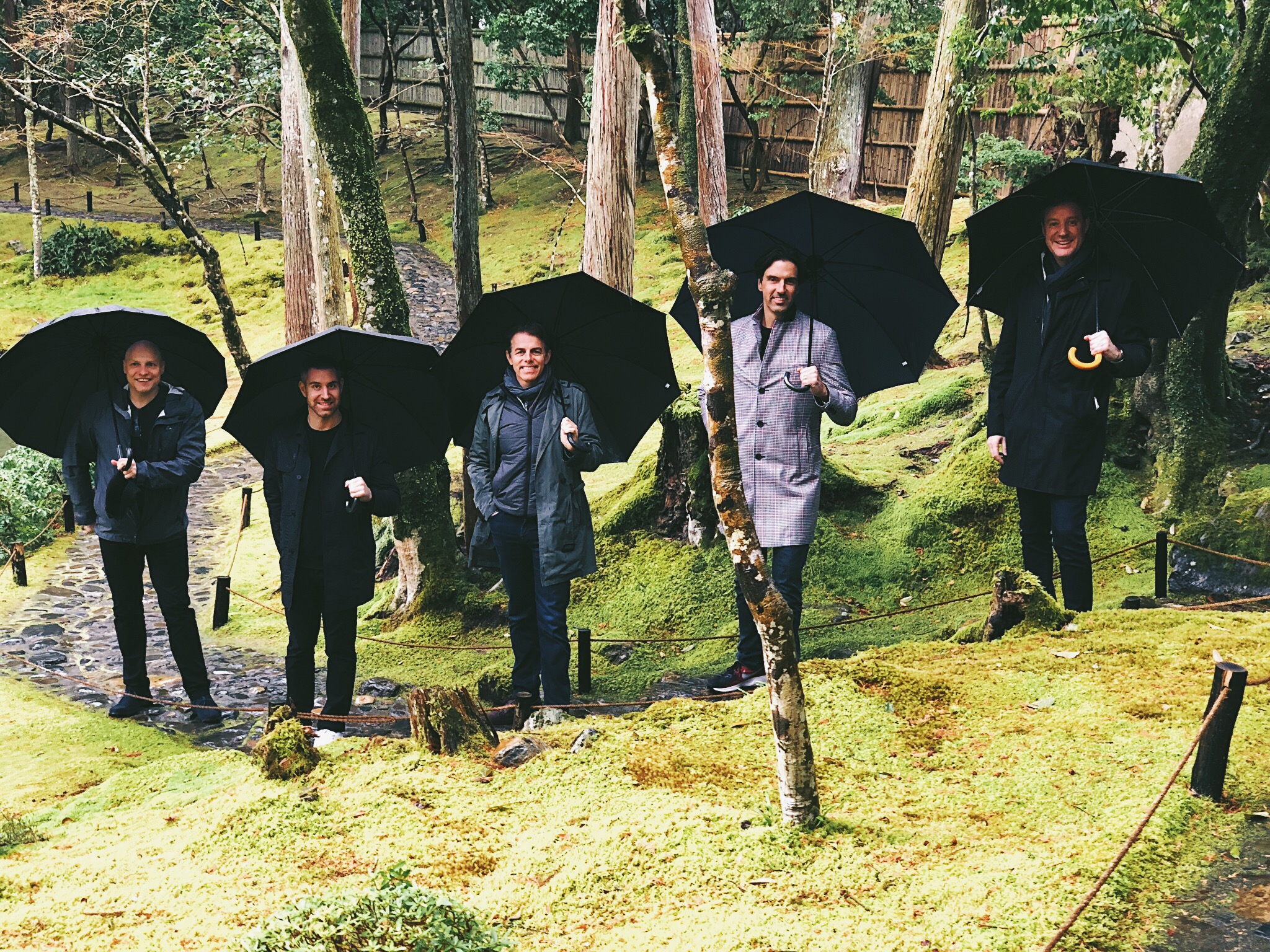
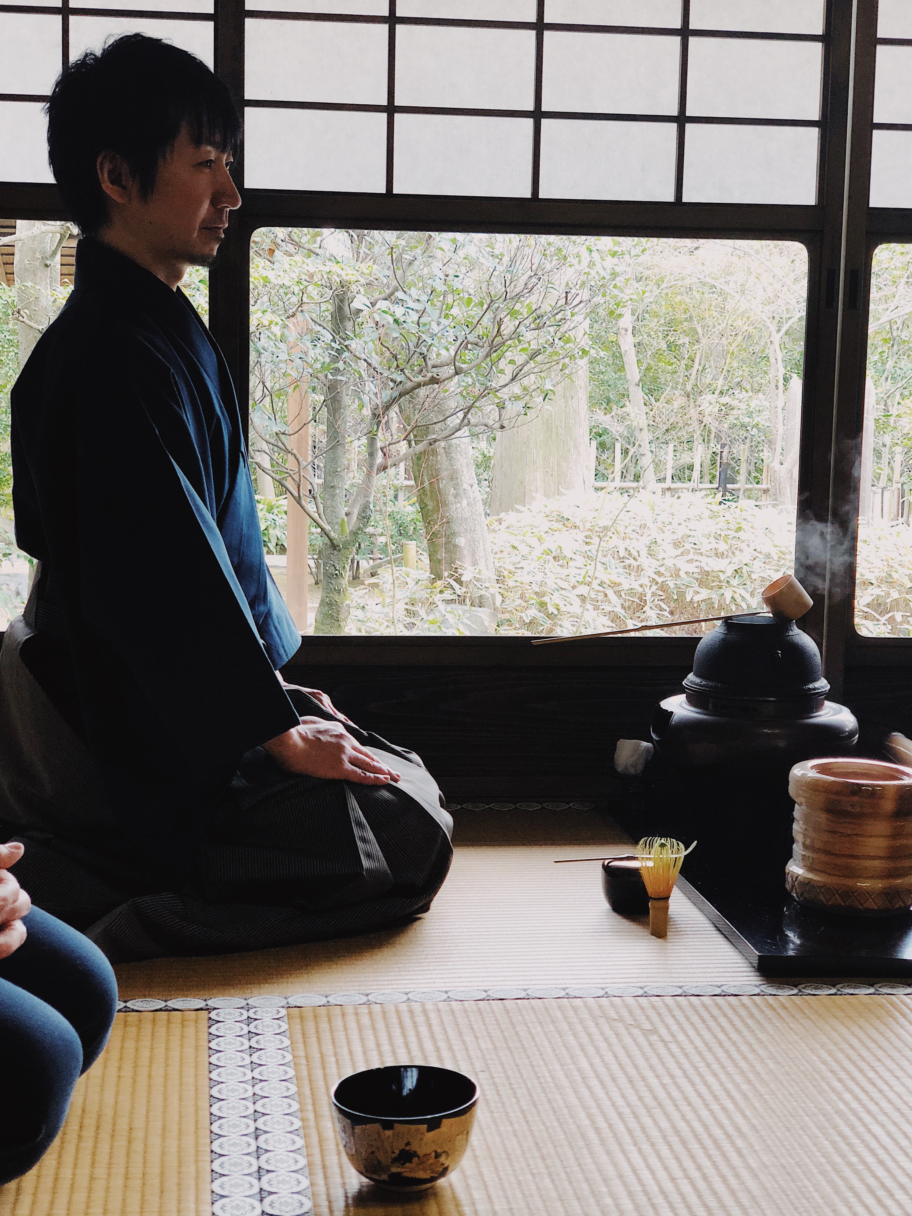
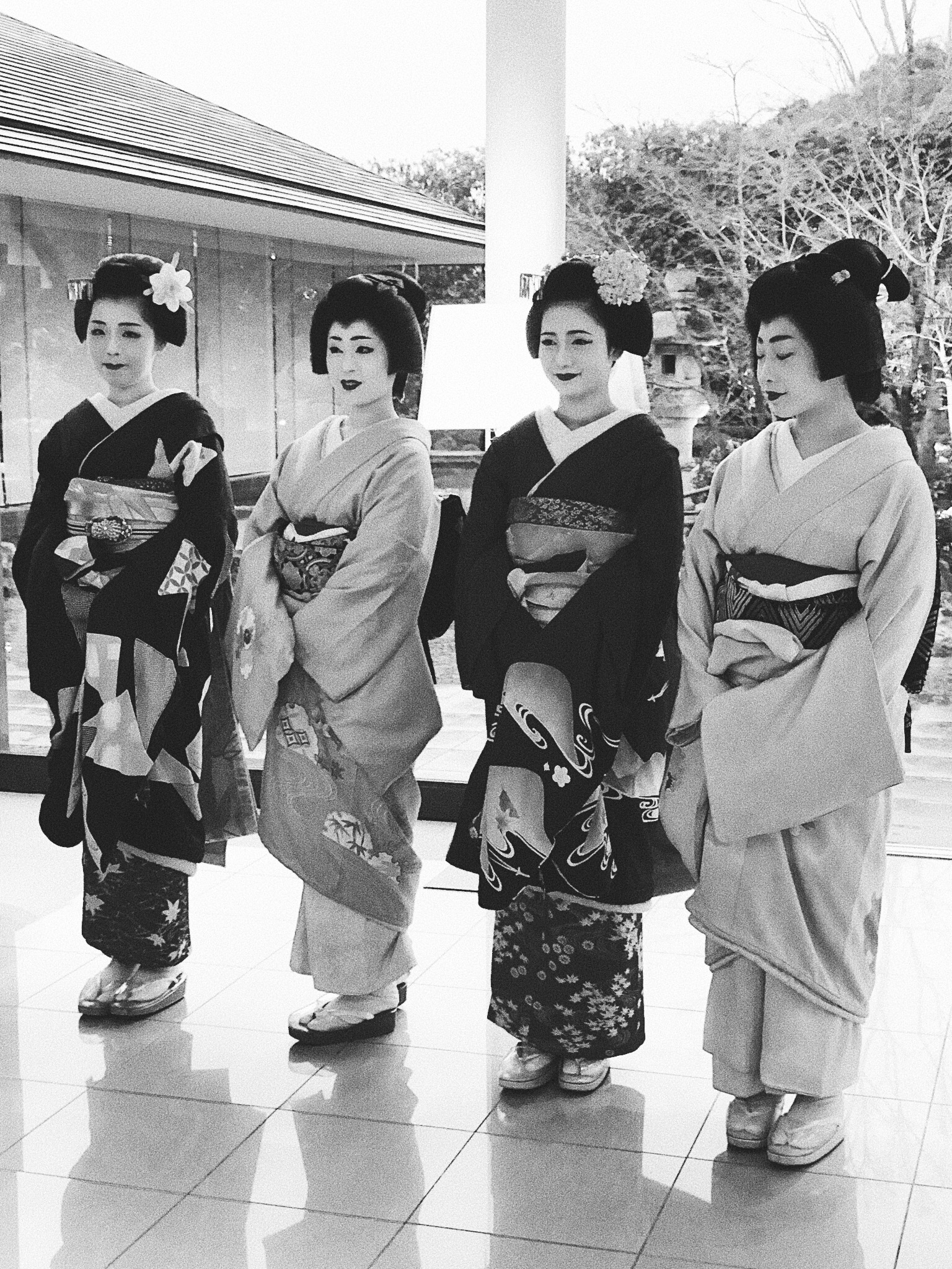
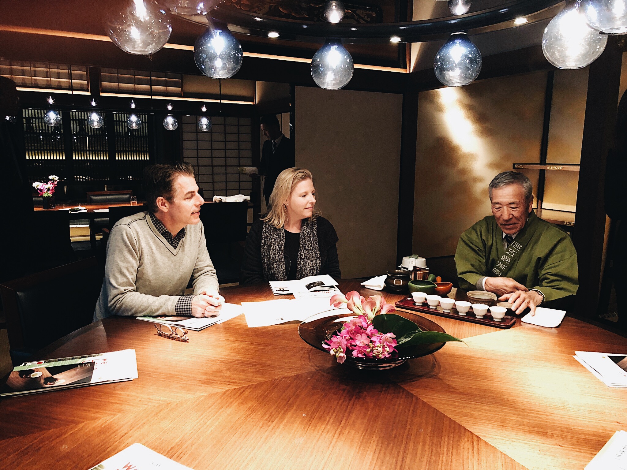
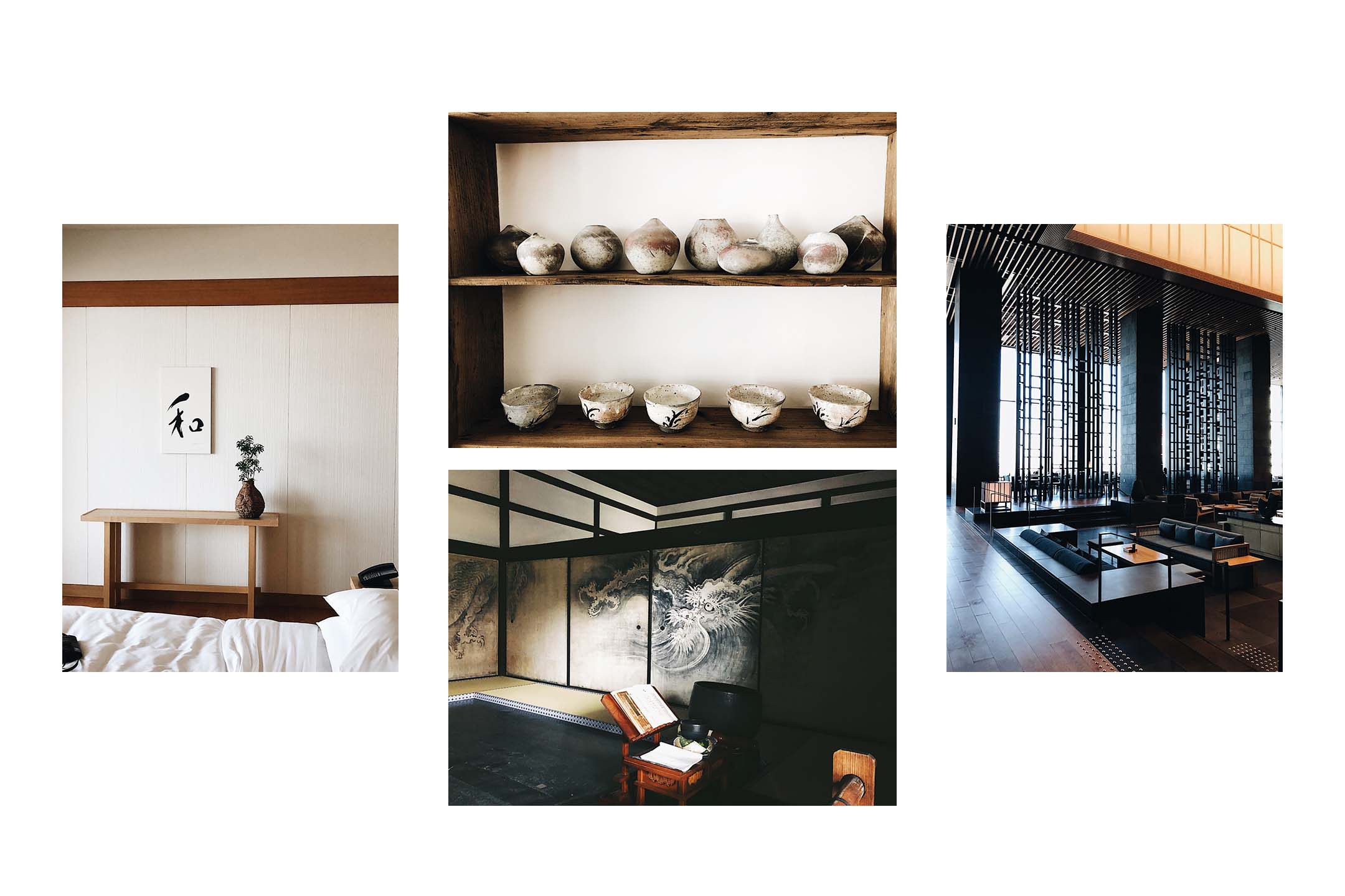
More than just a site or a destination, the greatest highlight of our trip was the takeaway lesson we learned from the country. We learned how intentional the Japanese are with regards to objects and design. It’s not about more, it’s about how you deal with one object in the room. It’s the mastery of one thing and how you display it. It’s not a more is better culture.
 WHAT ELEMENTS OF TRADITIONAL JAPANESE DESIGN ARE IMPLEMENTED INTO SOUCIE HORNER INTERIORS?
Perfection, mastery and intention are key elements in how we approach design. It was interesting how our process mirrors some aspects of traditional Japanese design.
WHAT WAS THE MOST CAPTIVATING DESTINATION AND WHY?
We stayed in a Zaborin Ryokan in Hokkaido. This experience takes the crown for the most captivating destination. A ‘Ryokan’ is a traditional Japanese inn. It was away from the city and allowed us a chance to understand the landscape. System and ritual translate into Japanese landscapes. You can see this particularly in the gardens. The Ryokan is in the middle of nature, where colorations and function of the hotel are traditional Japanese design but the building design is modern. This concept translates into the popular trends we are seeing everywhere. For example, think of how cabins are currently designed. The design is disparately modern compared to its surroundings.
WHO ARE YOUR FAVORITE JAPANESE DESIGNERS?
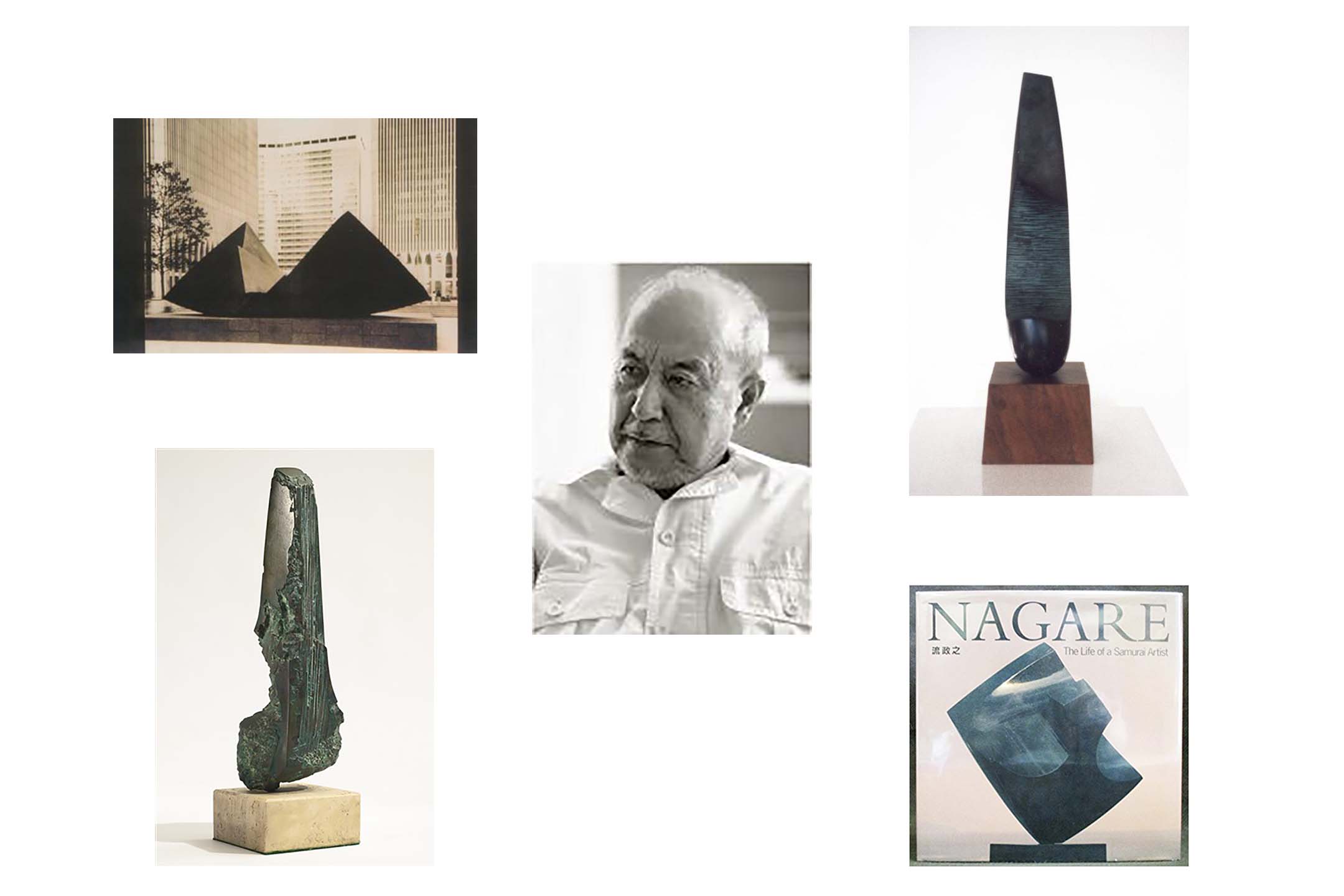
We dined with the creative director of Zaborin and discovered he had a gallery. We were given a private tour and it is there that we discovered the work of one of the artists he collects, Masayuki Nagare. Nagare is a Japanese modernist sculptor known as the “Samurai Artist.”
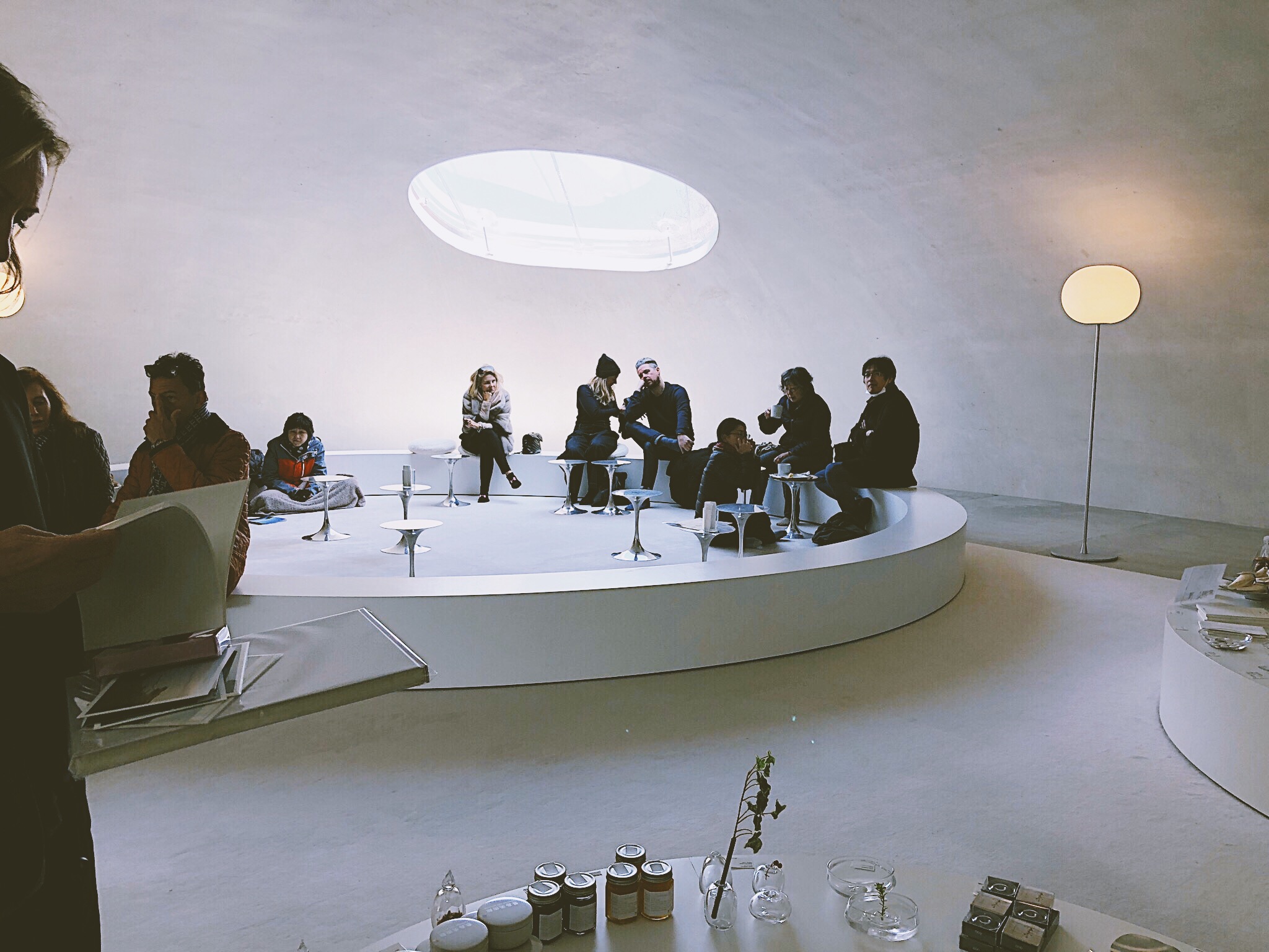
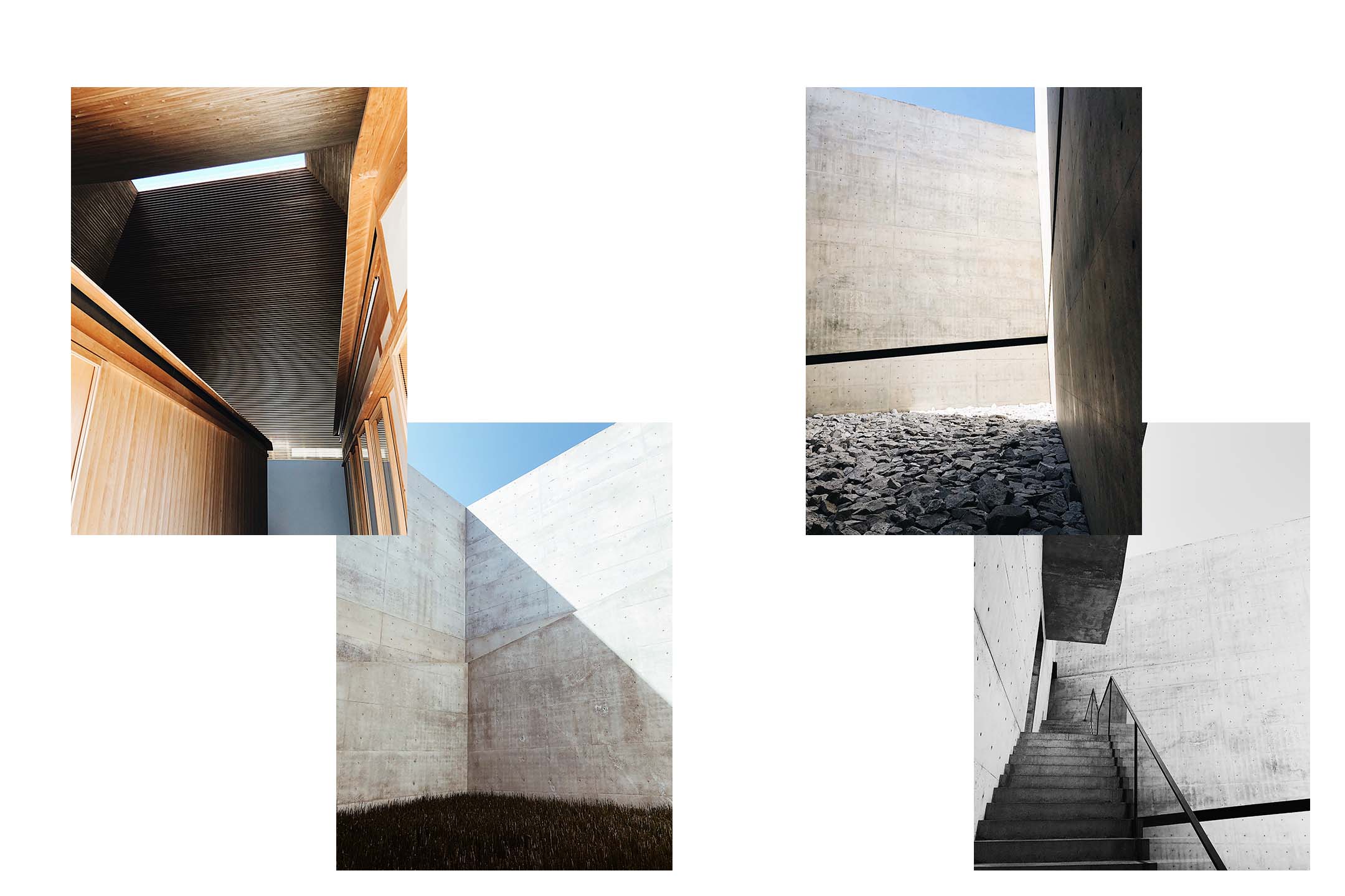
On Naoshima, we were taken by James Turrell’s “Open Sky” light installation at the Chichu Art Museum.
NAOSHIMA’S ‘ART’ ISLAND HAS A SHORT BUT RICH HISTORY. THE FOUNDERS HAD GRAND DREAMS OF CREATING AN ISLAND ABUNDANT WITH ART, CULTURE AND EDUCATION WHERE CHILDREN AND ADULTS FROM ALL OVER THE WORLD COULD GATHER. COULD YOU GIVE A SENSE OF WHAT IT WAS LIKE VISITING NAOSHIMA?
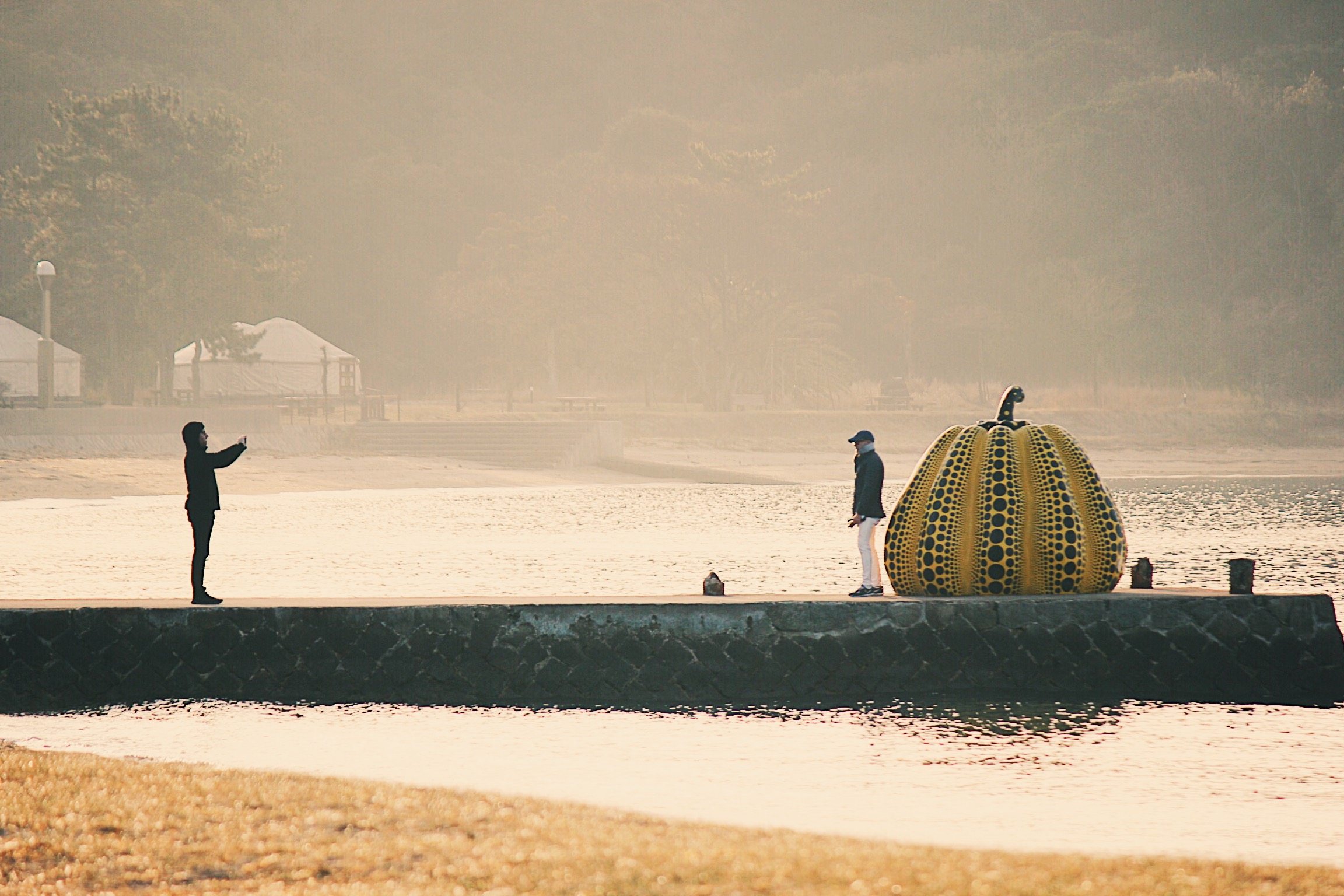
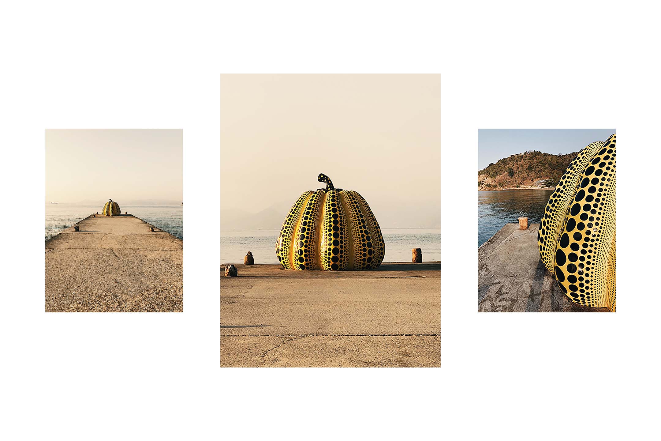 Naoshima Island is a study of how art can really create community and tourism. Prior to the commissioned work, it was an industry island where they were dumping tons of chemicals into the oceans. It’s still a crazy clash of industry and art form. But what’s great, is that it’s a different perspective. If they can continue to develop Naoshima, the island will only provide a richer experience.
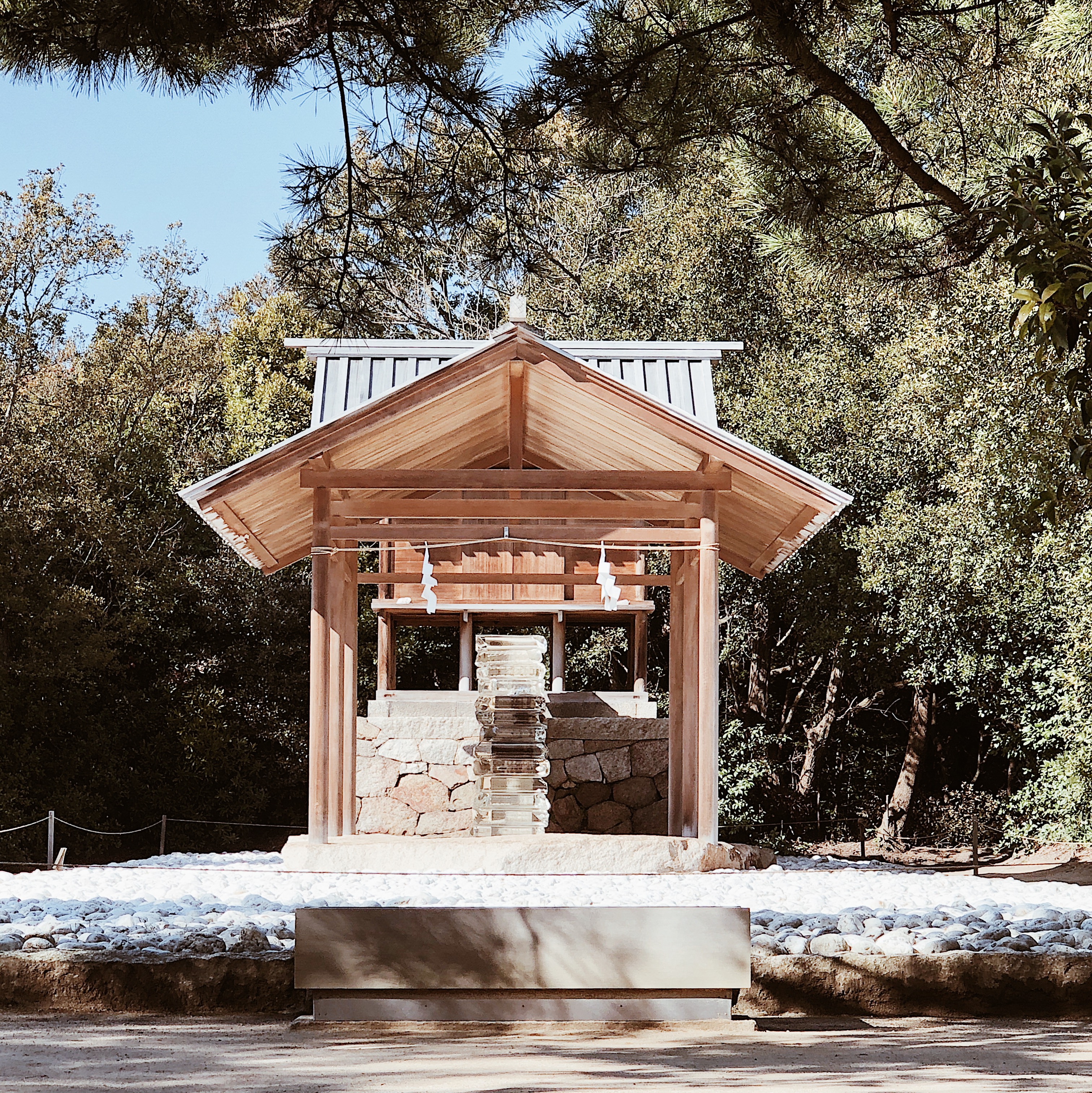
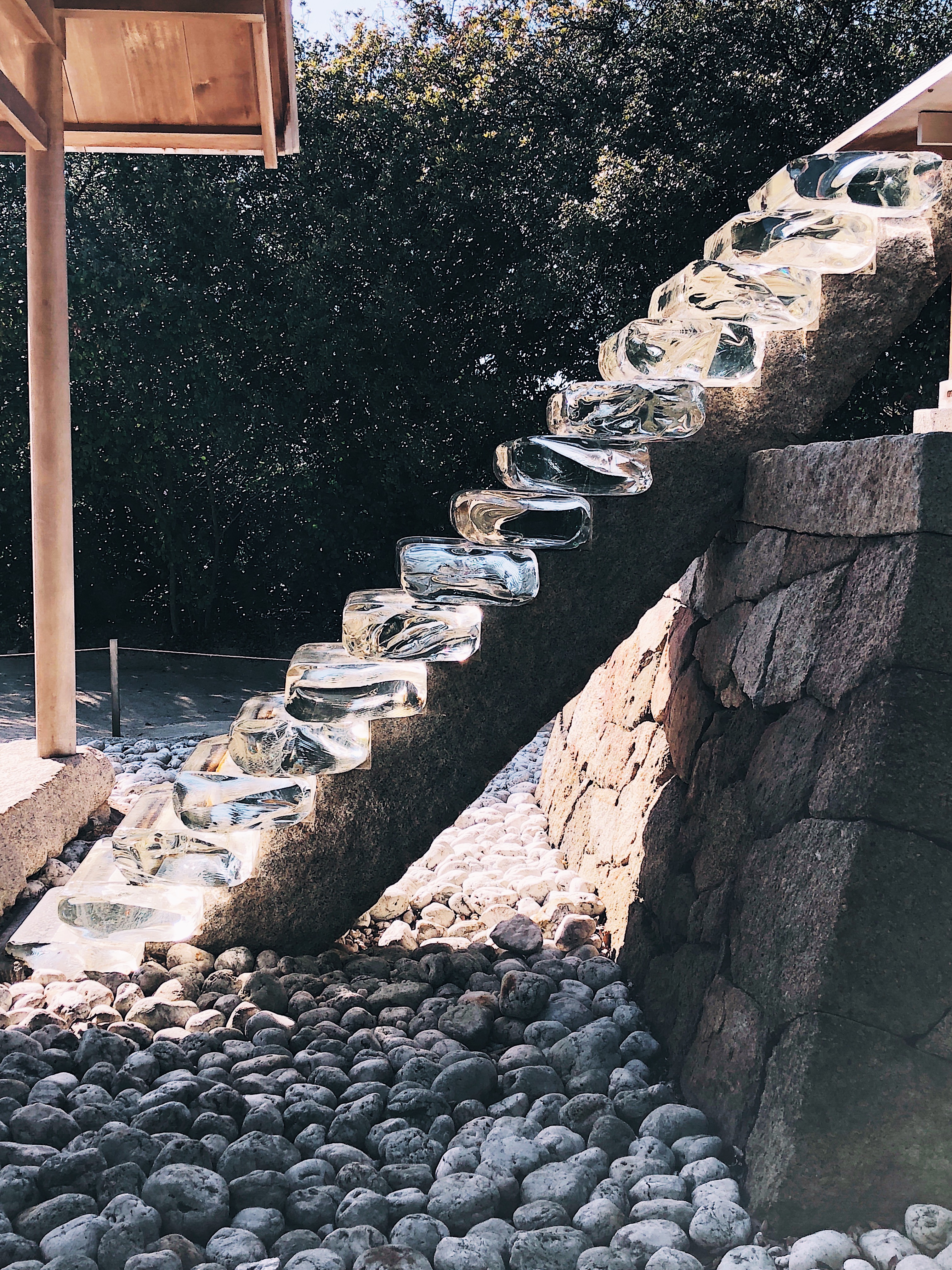
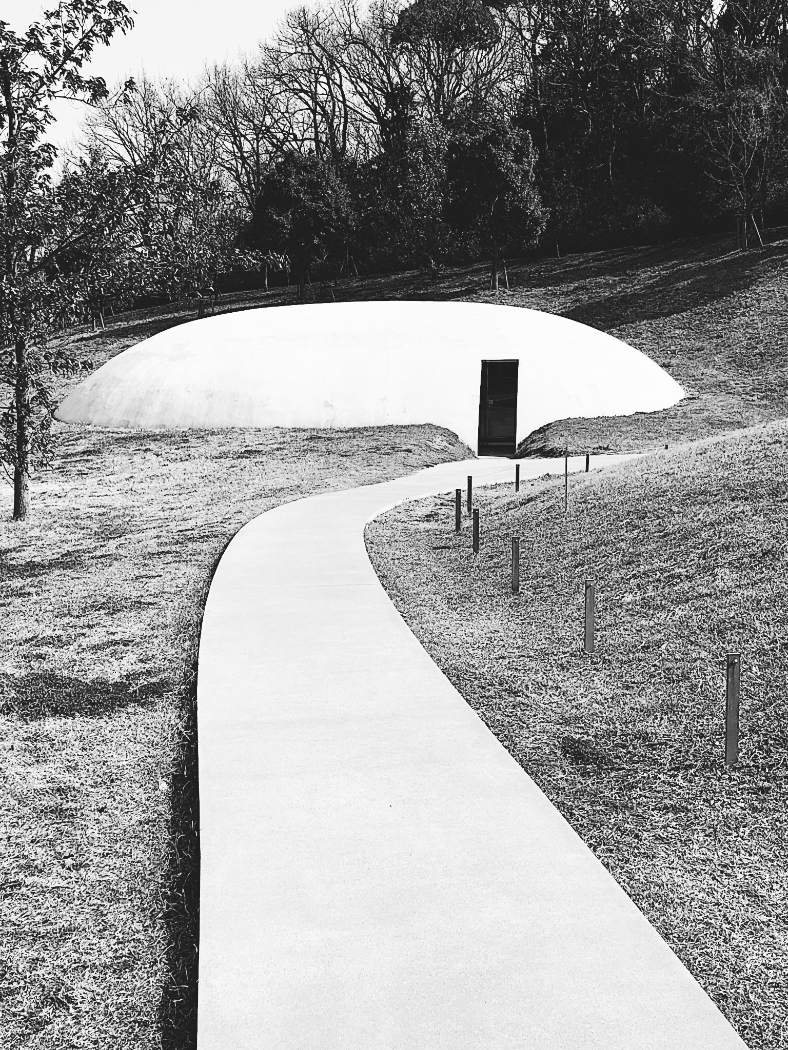
While Naoshima was a highlight of our trip, what truly created a deep impression was the Teshima Art Museum. This, for us, was a more emotional experience. The museum is described as a “womb” as there are no distinguishable walls or columns. Conceptually, it’s a very introspective place. You walk in, and it’s very large, but also shaped. Something perhaps you’d see in a Star Wars film. There are two openings out of an oblong shape and the wind blows through and they don’t allow you to talk in this space. You’re standing in an enormous organic shape with two open ends, with the wind whistling through, and when you look down, there are areas of water bubbling up. It’s mesmerizing. It creates a very emotional response to architecture. The question that emerged from our experience was “how much can architecture and art shape an emotional experience?”
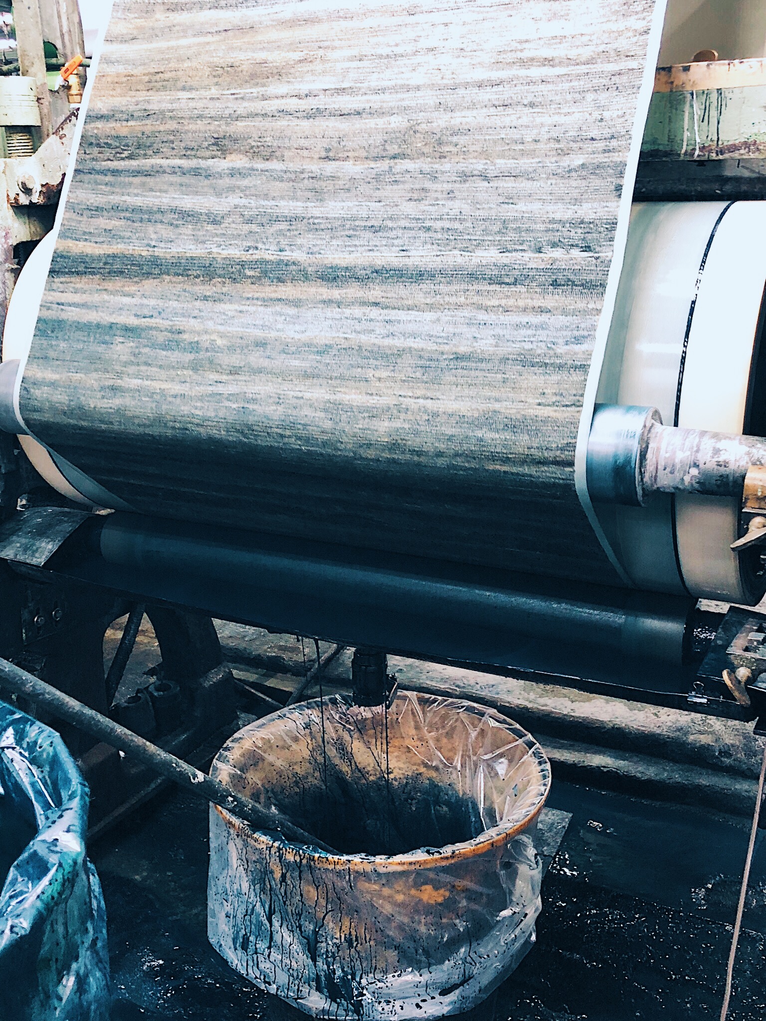
COULD YOU EXPLAIN YOUR EXPERIENCE WITH HAND SILK SCREENING WALLPAPER AT THE PHILLIP JEFFRIES MILL?
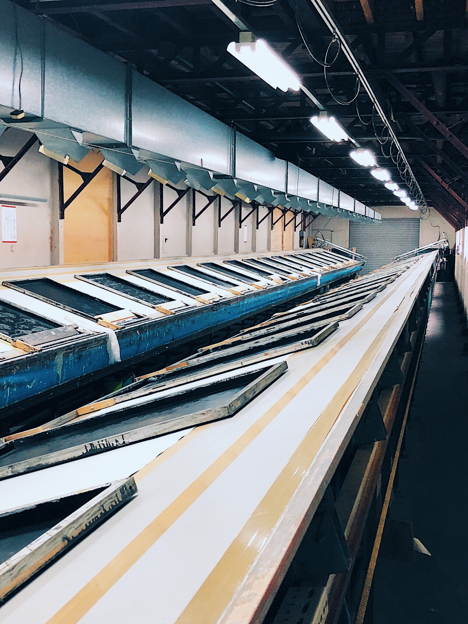
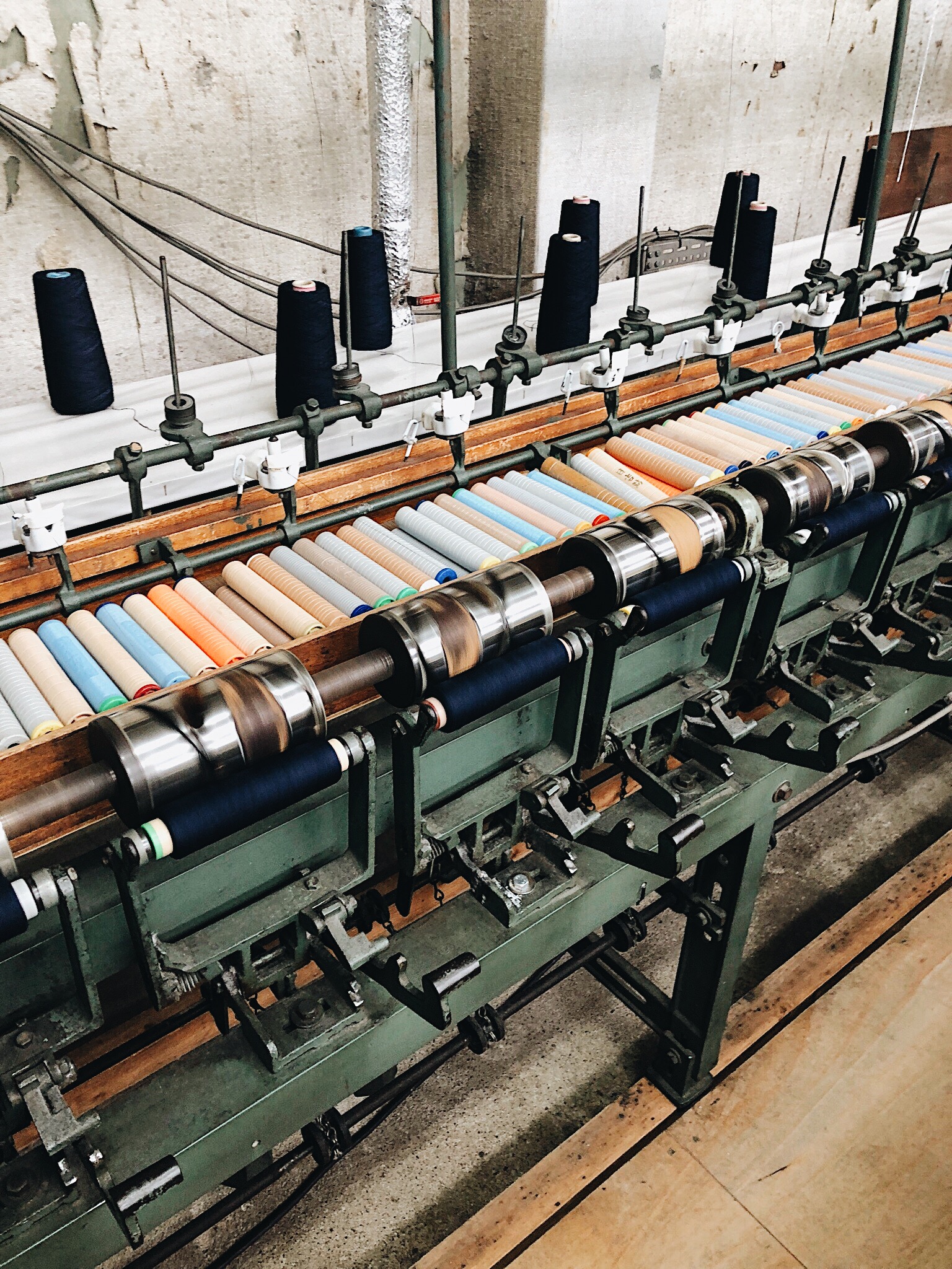
It goes back to the idea of perfection, mastery and intention in one’s craft. Recognizing that someone is making this product by hand. When you experience the craft firsthand by doing it, you can no longer complain about quality control or why quality takes time. We look at a wall covering in a showroom as a commodity. But when you try the craft with your own hands, then you understand the precision, time and craftsmanship behind it. It provides perspective.
WHAT WERE OTHER IMPRESSIONABLE SITES IN JAPAN?
The National Museum of Modern Art in Tokyo was unforgettable. The entire museum had installations about perception.


